Famille Helfrich
Famille Helfrich, umbrella brand of the Les Grand Chais de France group, was created to access a high-end market in retail, restaurateurs and sommeliers across more than 170 countries. Originally from Alsace, the brand can rely on more than 70 estates located in the 7 major wine regions of France, its know-how as an owner-winemaker and its exceptional wines.
In addition to the brand identity, MENDELEIEV signed his “birth certificate”. A travel diary, between book and magazine, distilling what makes the Helfrich Family unique. These are estates, their history and terroir, but also the men who work there that we discover over the pages, in order to better understand the personality of the wines created there. D’un Domaine à l’Autre is a traveling report made of encounters and engraved moments, a story of what makes the consistency of the brand but also its finesse and coherence.
- Design
- Editorial
- Photography

A Mook, hybride by nature
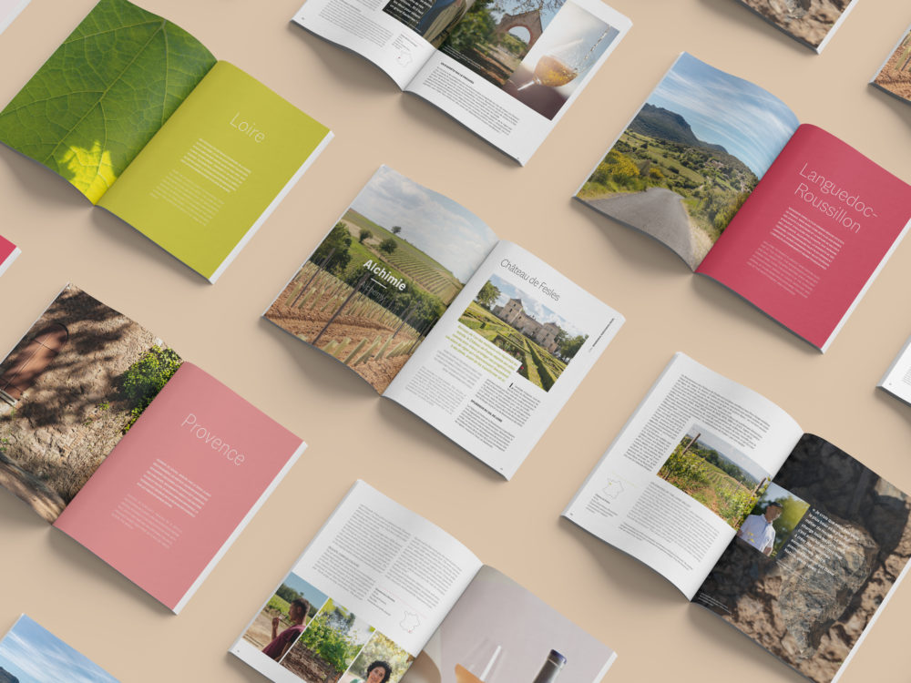
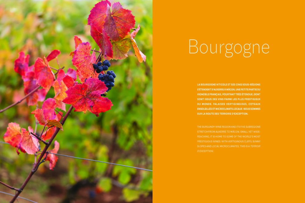
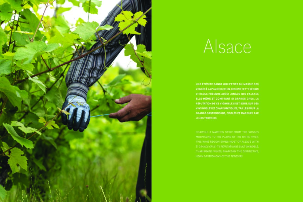
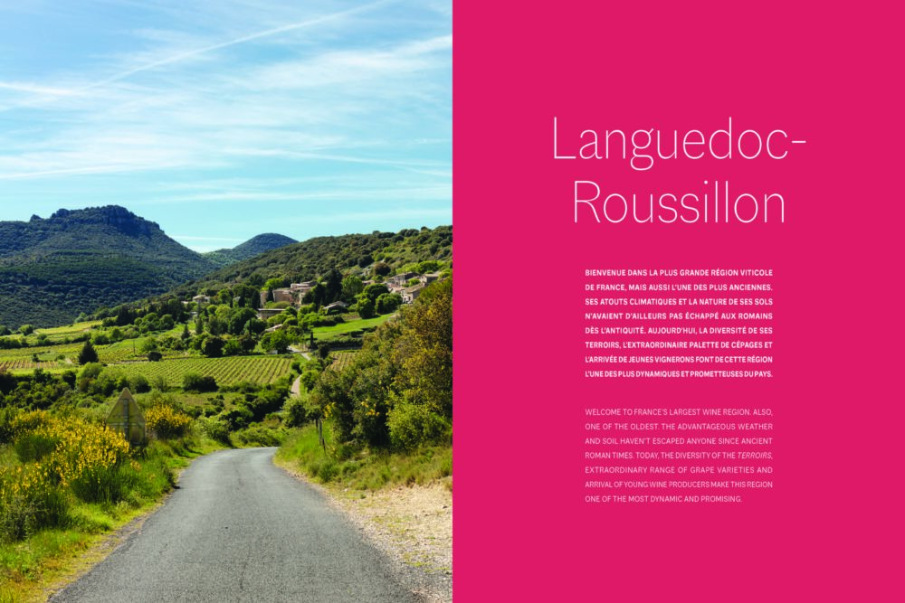
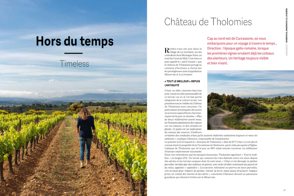
The 130-page magazine, written in French and English, presents 23 estates in France, across the 7 major wine regions: Alsace, Burgundy, Jura, Languedoc-Roussillon, Provence, Bordeaux, Loire.
Printed in 6,000 copies for its launch, this project has been taken care of in every detail : from the choice of paper, the result of an exclusive collaboration with the Italian manufacturer Fedrigoni, to the printing entrusted to the prestigious printer Escourbiac.

Travel note book as a manifesto
Images taken on the spot and texts reflecting the fascinating exchanges with culture managers or cellar masters, reflect the brand’s desire to differentiate itself from more traditional marketing approaches.
The Artistic Direction has worked to compose pages illustrating the terroir in all its splendor: from the skies to the basements, including the gestures of men.
Announced objective: to reveal itself and give Made in France a real guarantee of authenticity to meet customers on the other side of the world.

Editorial
Expertise, “humility and freshness” in style and tone, meant to reflect the positioning of the brand and its modernity.
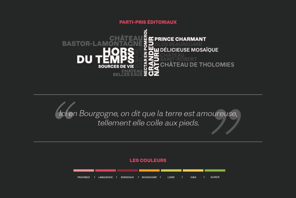
For example, short titles and catchphrases, sometimes surprising, have been favored in order to break with a certain descriptive classicism inherent in the sector.
And color codes defined according to the wine regions.

Photography
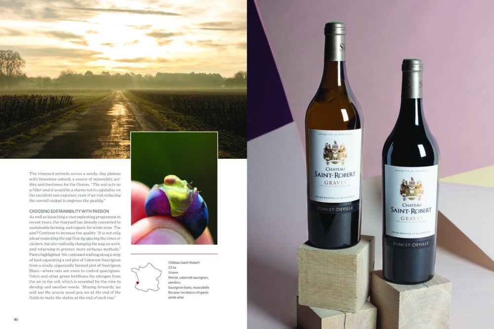
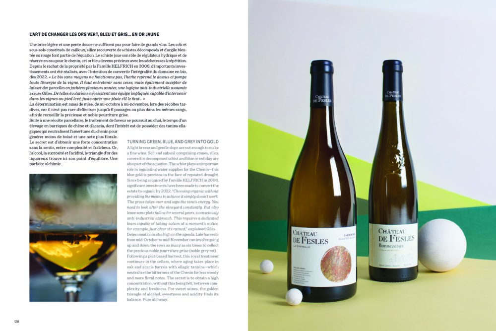
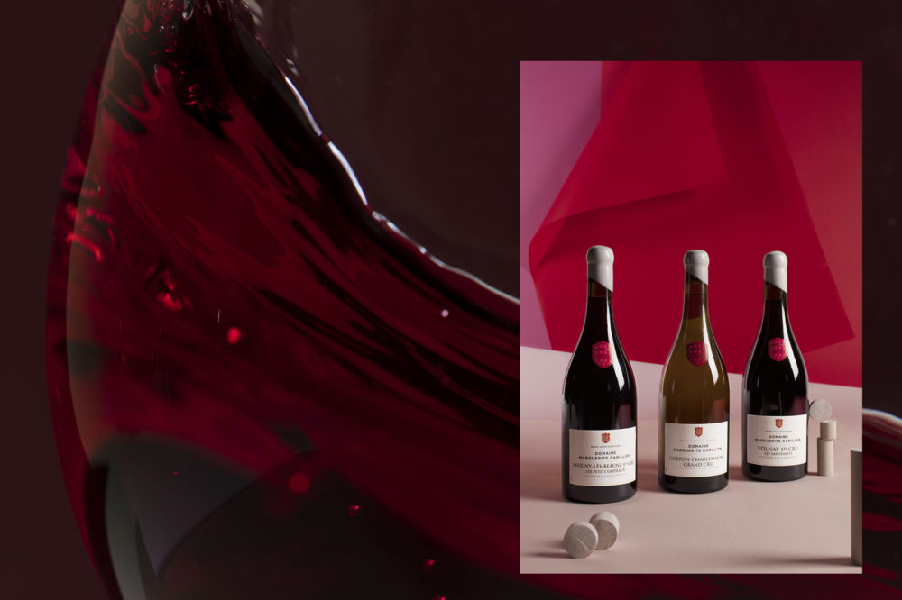
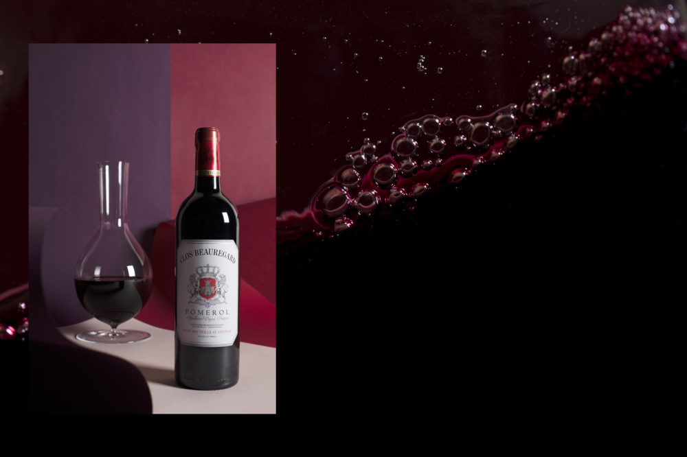
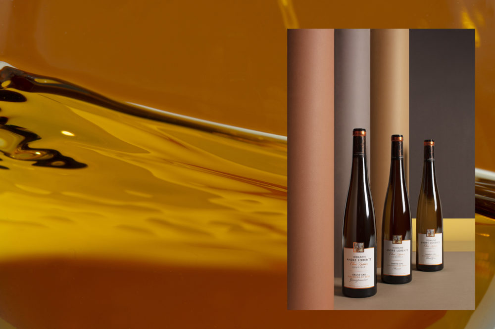
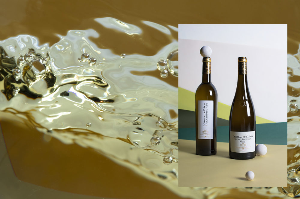
Close-ups – wine, vine, terroir, gesture – to evoke this relationship to materials and know-how.
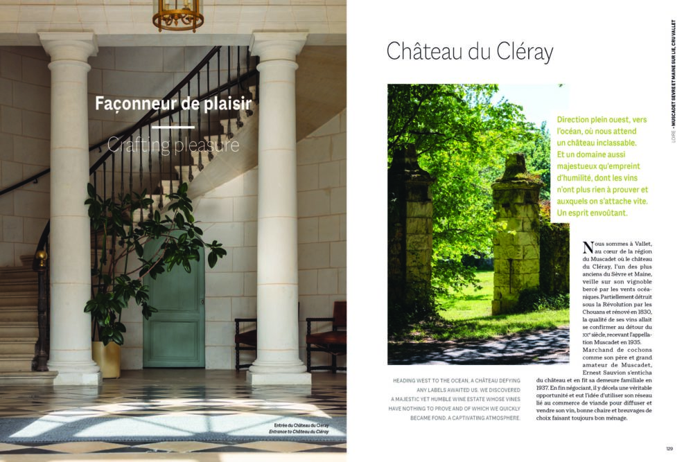
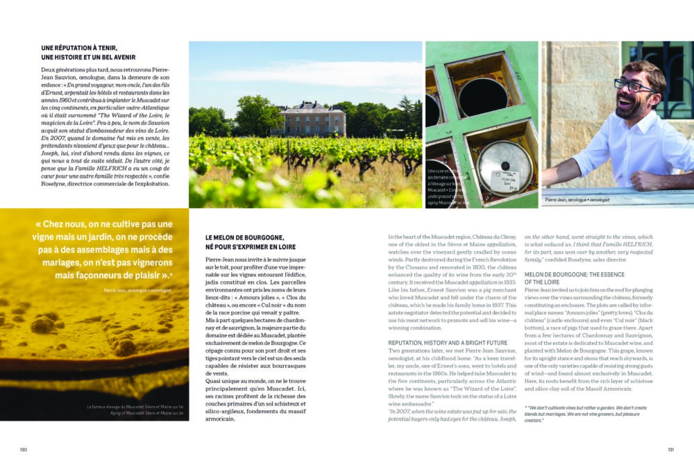
Large plans -vineyards, cellars- to testify to the richness of the terroirs, to the authenticity.
Portraits highlighting the work, the gestures but also the human, the family, the heritage.
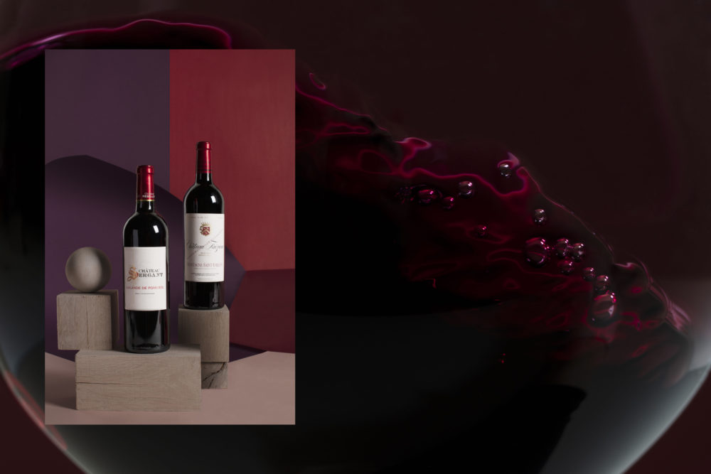

Stills
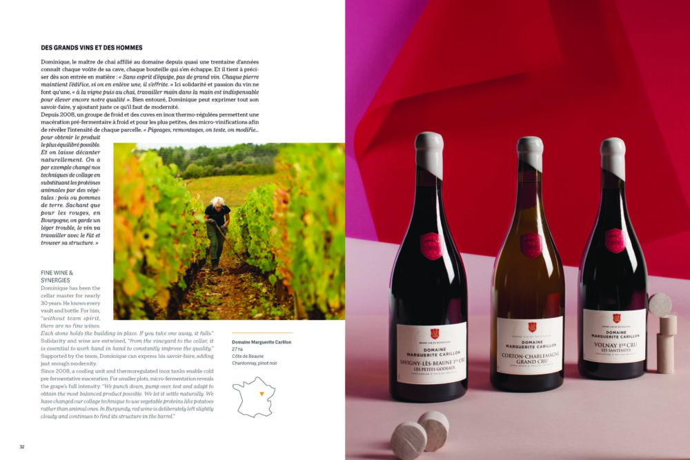
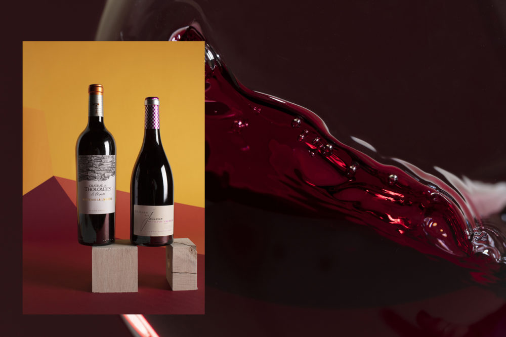
Compositions highlighting the color of the wines, their labels, their reflections, and playing with decorations that summon dynamism and modernity.