Grands Chais de France
The Grands Chais de France is the leading winemaker in the country and above all, the leading exporter of wines and spirits, with the emblematic brand, J.P. Chenet, the best-selling “tricolor” wine in the world. The turnover of the company, exceeding one billion euros, is achieved for 80% in export, in 173 countries.
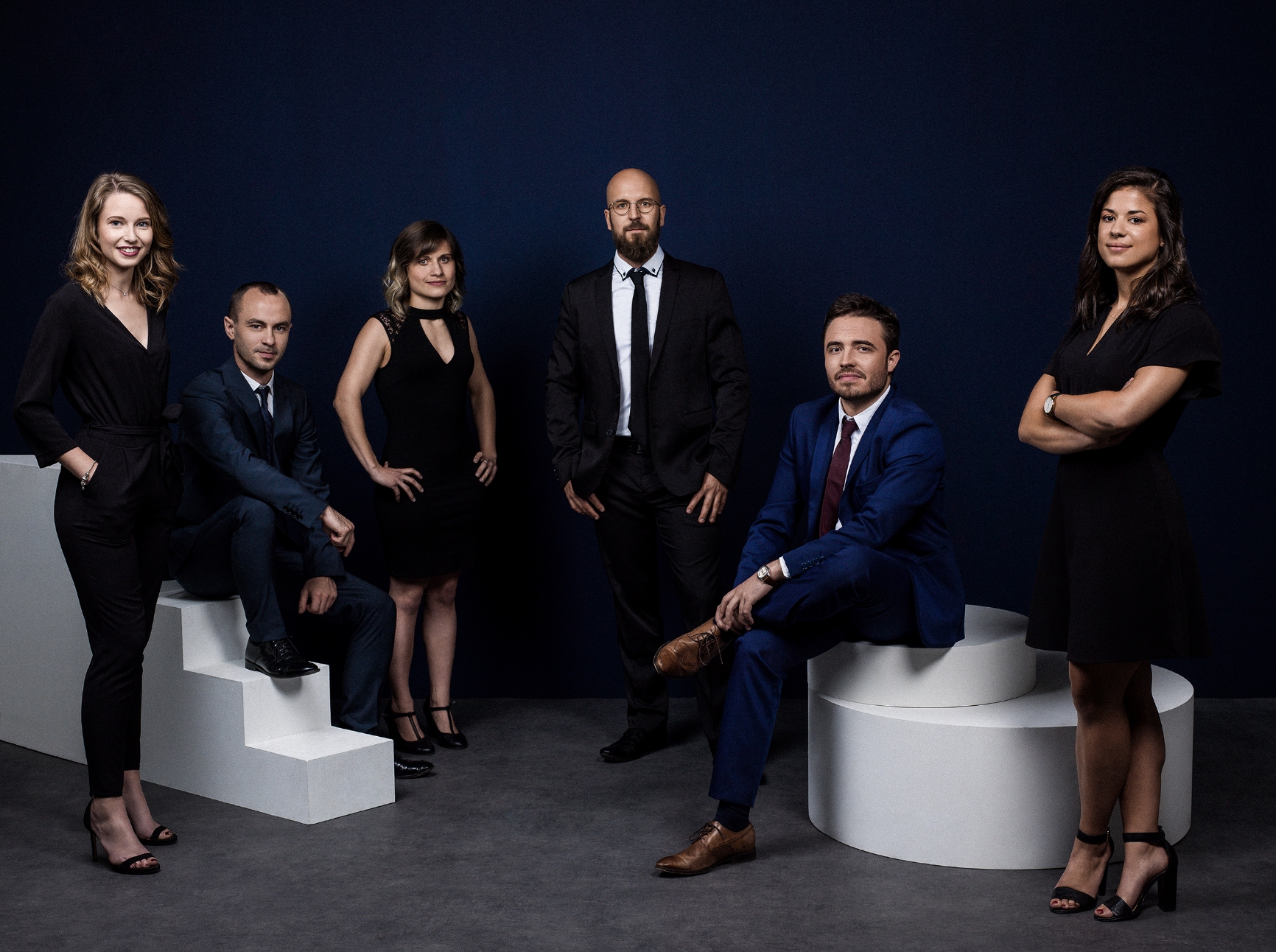
In order to make up for the group’s lack of notoriety in the high-end segment, and thus promote all of its approaches within the French vineyard, GCF wanted to install “Famille Helfrich” as a real umbrella brand. In terms of reaching a niche BtoB clientele, made up of key accounts in international retail, catering and sommellerie, it was imperative to stand out from the group without losing sight of what made it successful. Thus was born “Famille Helfrich”, from the name of its founder, at the origin of the success story started in 1979. Positioning and fundamentals, brandbook and first founding act were thus entrusted to MENDELEIEV.
- Branding
- Design
- Identity
- Strategy

Brand Territory
Search around the essential components of the terroir, the people and the wine. The strain or the vine act as powerful links anchored in the soil within this renowned family, but also among its collaborators. Although the Helfrich family owns more than 70 estates in France, it defines itself as a winegrower-owner, respectful of working the land.
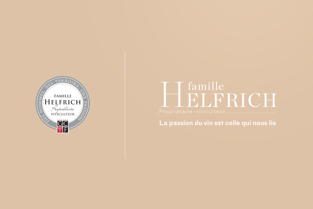

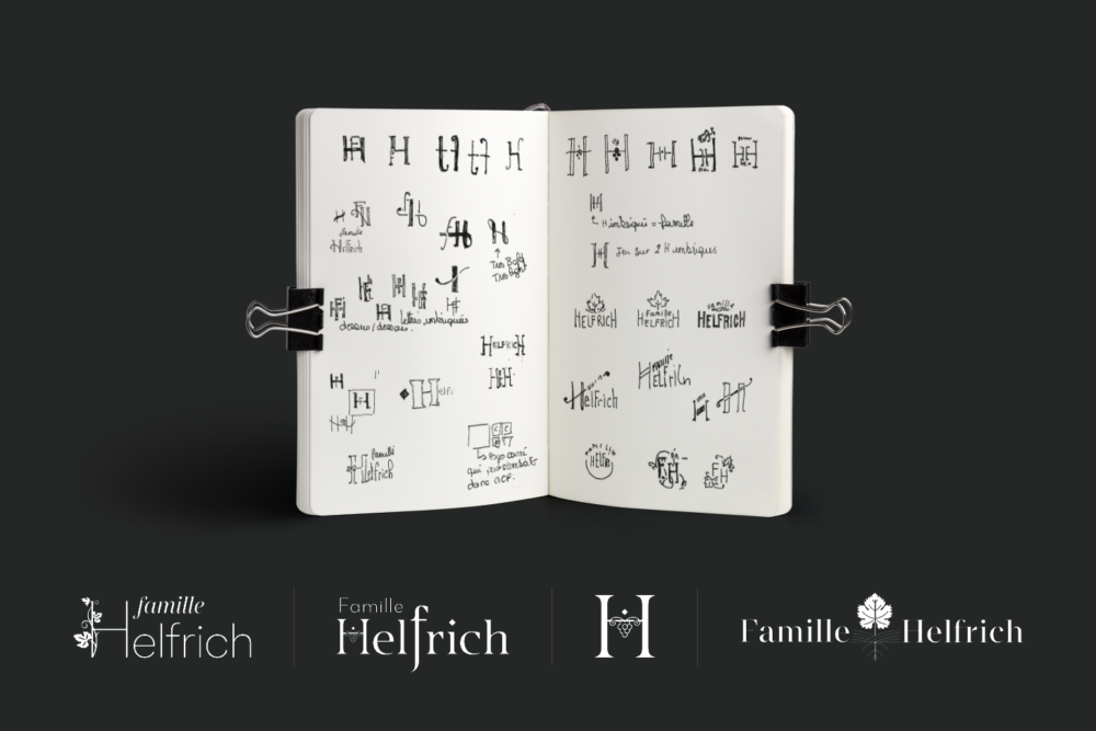
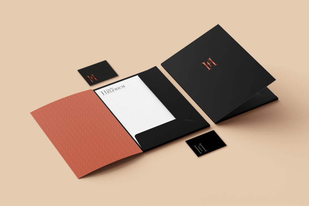
Creation of the logo and signature
The pre-existing crest, a bit complex, has given way to a sober and statutory logotype embodying the prestige of a family, but also, its heritage base.
The signature evokes promise and extra soul of the brand: know-how, respect for the terroir, for the product with a claimed family spirit. A unifying passion, wine has become an unbreakable link within the company.
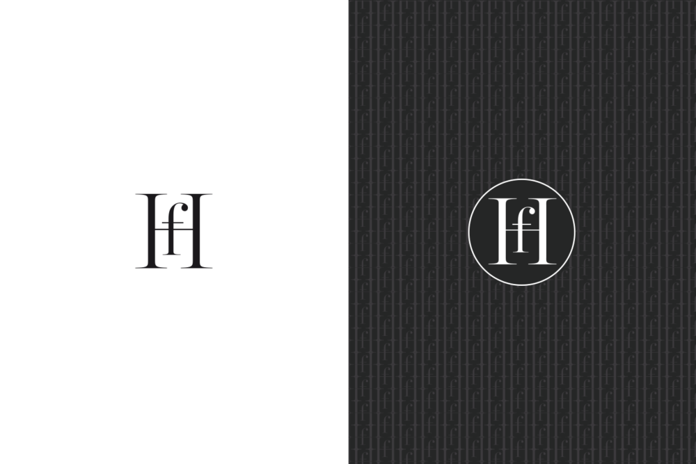

Monogram & Pattern
Creation of the brand’s monogram suggesting, by its interplay of depth between the two initials, a gate or an alley leading to an estate.
This label and its variations in the form of a pattern, in white, black or hot stamping, are intended to sign or dress more exceptional media: packaging, event objects, special prints, vintage vintages, etc.

Graphic and editorial charter
Design of the brand book with complete recommendations: artistic, editorial, photographic direction and first print and digital applications to allow the brand to frame the production of its media in the coming years. First realization, a brand kit including the basics such as business cards, correspondence, letterhead and pocket.